Blue State Digital is a digital marketing agency focused on working with clients who want to make the world better. When I started, I primarily designed microsites, landing pages, and social and email campaigns for a variety of clients, including Google, the Vietnam Veterans Memorial Fund, and YMCA of NYC. After a year, I transitioned onto a newly-formed internal marketing team where I helped extend our new brand across our website, social and email graphics, and marketing materials.
When BSD’s new brand was launched in early 2013, there was little work done to take that brand further than a new pitch deck, website, and logo, mainly because there weren’t resources to do so at the time. However, once the marketing team was formed, the first brand void we set to fill was on our social channels.
Getting serious about social
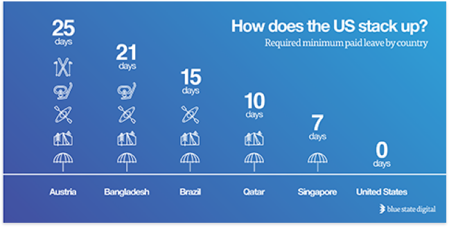
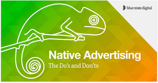
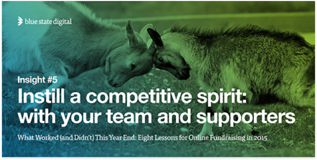
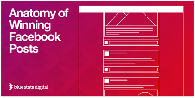
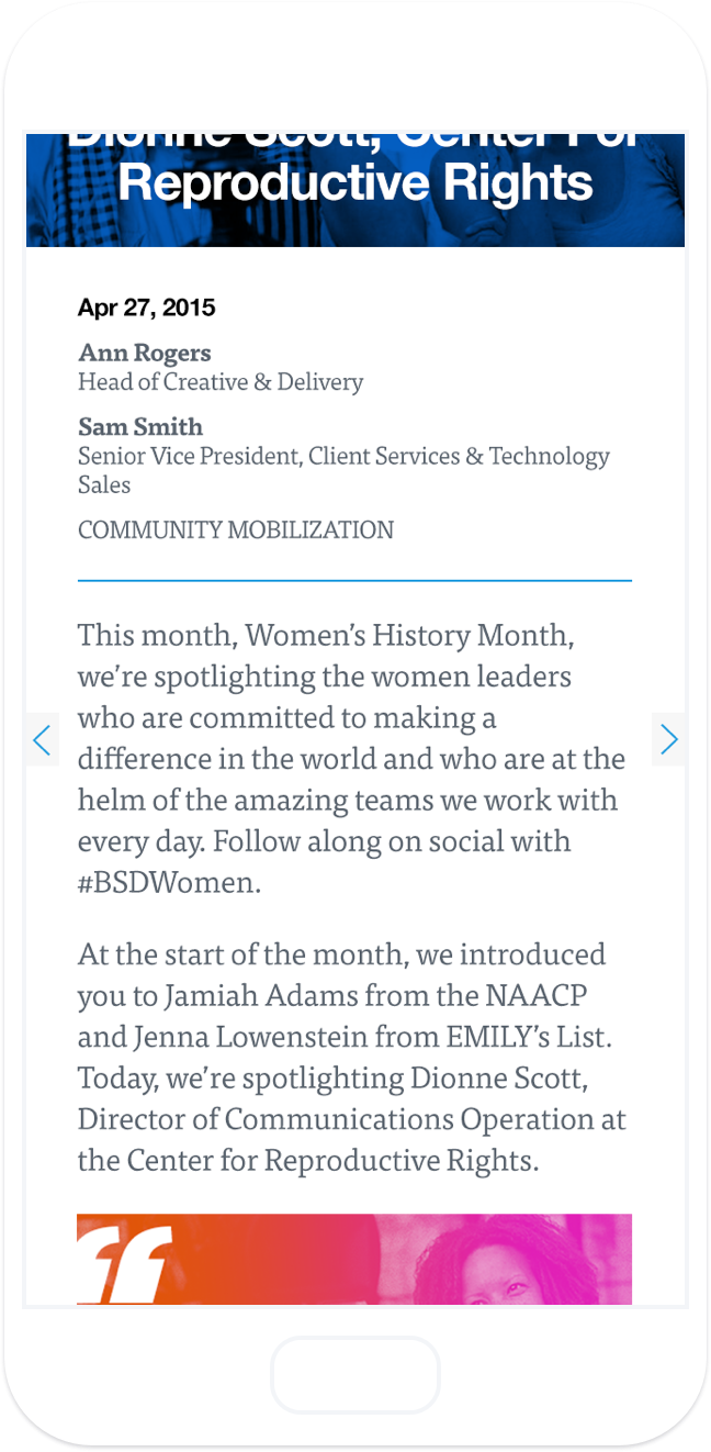
Our social graphics were the thing that evolved the most during my time on the team. In the beginning, myself and the other marketing designer focused on making sure every new graphic was consistent with the previous ones. That got old quickly, and as I got to know the brand better and become more comfortable with it, I decided to explore options that fit within the family of our brand without feeling stagnant or the same as the last graphic. The result was graphics that were heavily influenced by the content they were supporting, rather than simply an angled gradient overlay on a chevron background with some text.
Updating marketing materials
Once we had our social needs taken care of, I moved on to updating our Pages and Keynote templates. This was right around the time that Pages and Keynote came out with a pretty large update, so not only did I have to learn the in’s and out’s of the new versions, I had to create brand new templates for them and train the entire company (a little under 300 people at the time) on how to use the templates and the programs themselves. The major considerations for creating both templates were: first and foremost, they had to be easy to use (which was especially difficult in the then-new version of Pages) and, secondly, they had to look custom enough to set us apart from competitors without needing custom design every time.
Redesigning the website
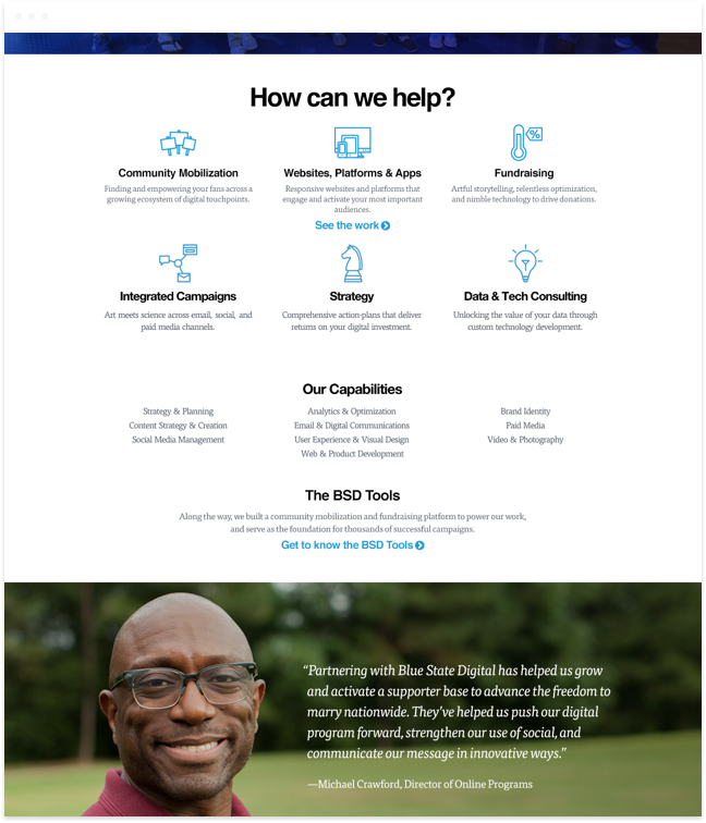
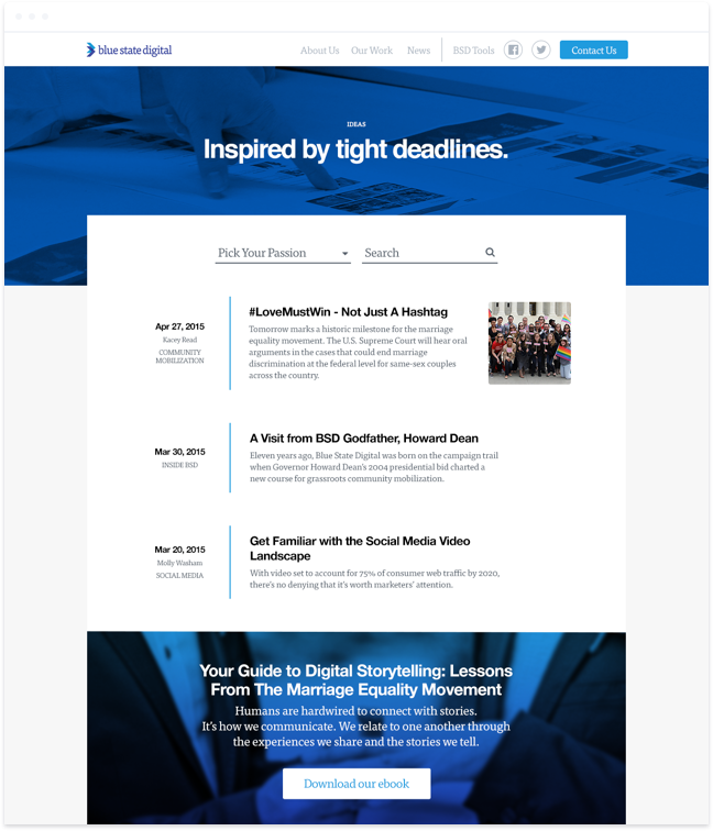
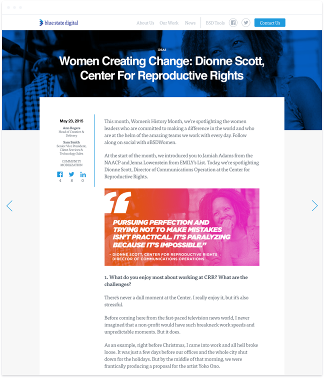
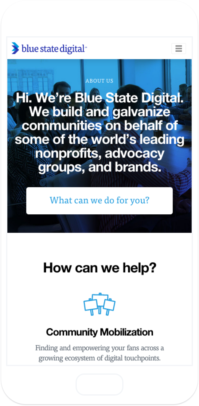
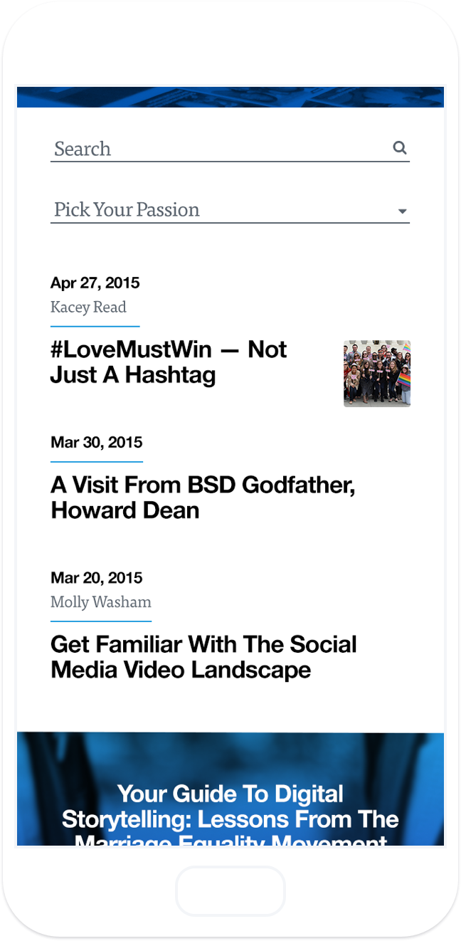
Next up, we decided to tackle the BSD website. While the other marketing designer and I had already been providing support by collecting and editing assets for new case studies and creating graphics as needed for blog posts, the team decided a refresh to the site was in order. However, because development resources were a bit lacking, I took the site on one page at a time, redesigning the About Us page and the Blog.
Creating an icon library
Although we exposed a general sense of our illustration and iconography style through our social graphics and marketing materials, there weren’t any real guidelines or set styles in place. So, I set to work defining those styles and generating an icon library with both specific icons in current use and generic icons for potential future use. These icons needed to feel unique with styling that could be easily replicated by any designer at BSD.
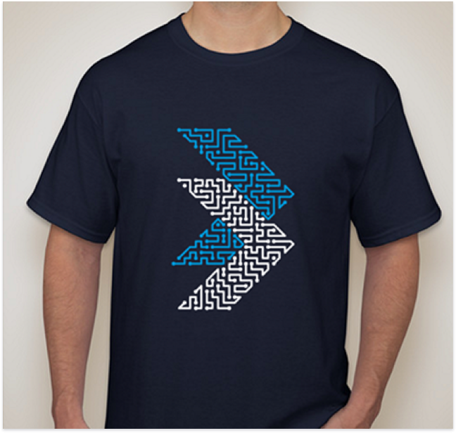
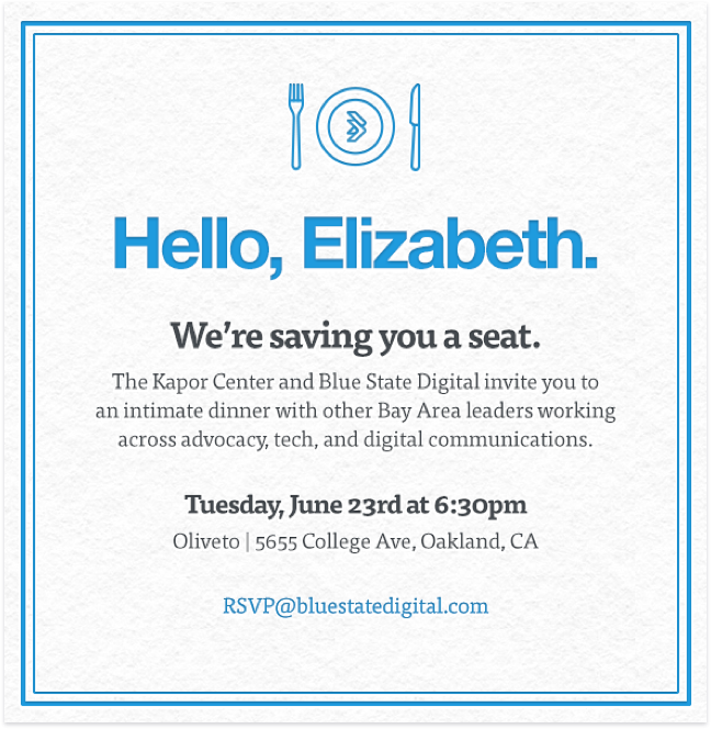
Spreading the chevron
One of the best parts about being on the marketing team was that, generally, the smaller the project, the more fun it was. I had the chance to work on everything from signage for the corporate apartments to chalkboard art in the DC office to invites for BSD-hosted events. While each of these projects had different audiences and different messages, I always tried to incorporate the BSD chevron in small andunexpected ways.
Looking back
Working on the marketing team at BSD taught me a lot about iterating through problems to get to solutions and opening myself up to the vulnerability of honest critiques. It is often difficult working on internal projects as you will always be your worst critic and everyone is more passionate about the solutions presented, but I found those problems can almost always be remedied by a sense of trust among teammates and separating self from the brand.