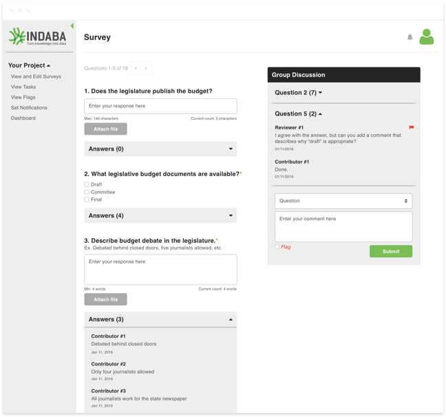
Indaba is a collaborative survey platform that turns qualitative knowledge into quantitative data, such as the quality of education across a select set of countries. It allows managers to set up surveys and timelines for those surveys to be filled out, reviewed, and revisited across a number of users. Once a survey is submitted, it is then passed on to an expert reviewer, who compares the information from each contributor and adds input. Finally, the knowledge from a collection of surveys is compiled and published into a data set, which can come in many forms, including maps, custom charts, and spreadsheets.
Amida acquired Indaba in 2015, at which time it only had a handful of clients. We worked to completely rebrand Indaba, redesign the marketing site, and rethink the platform in order to make it easy to use and introduce some much-needed features. Built on Bootstrap, the platform needed to be able to load quickly for those with slow internet connections and be flexible enough to accommodate a variety of languages, input types, and user needs.
Starting fresh
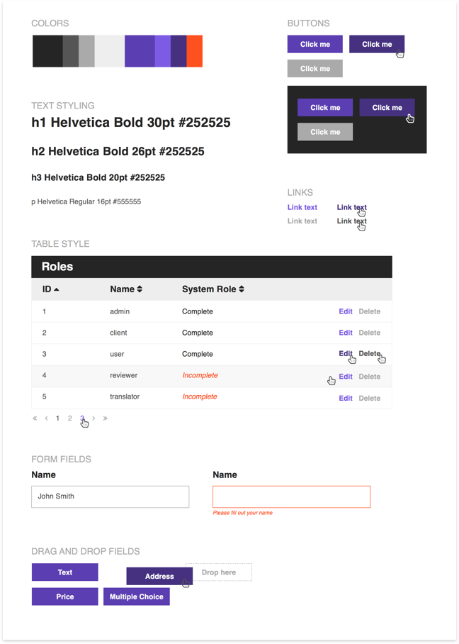
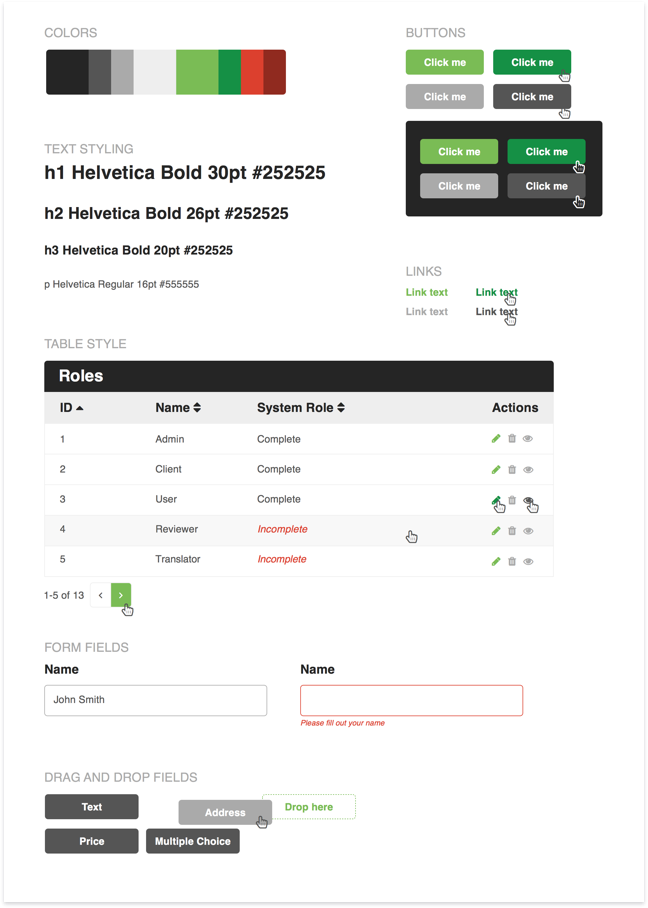
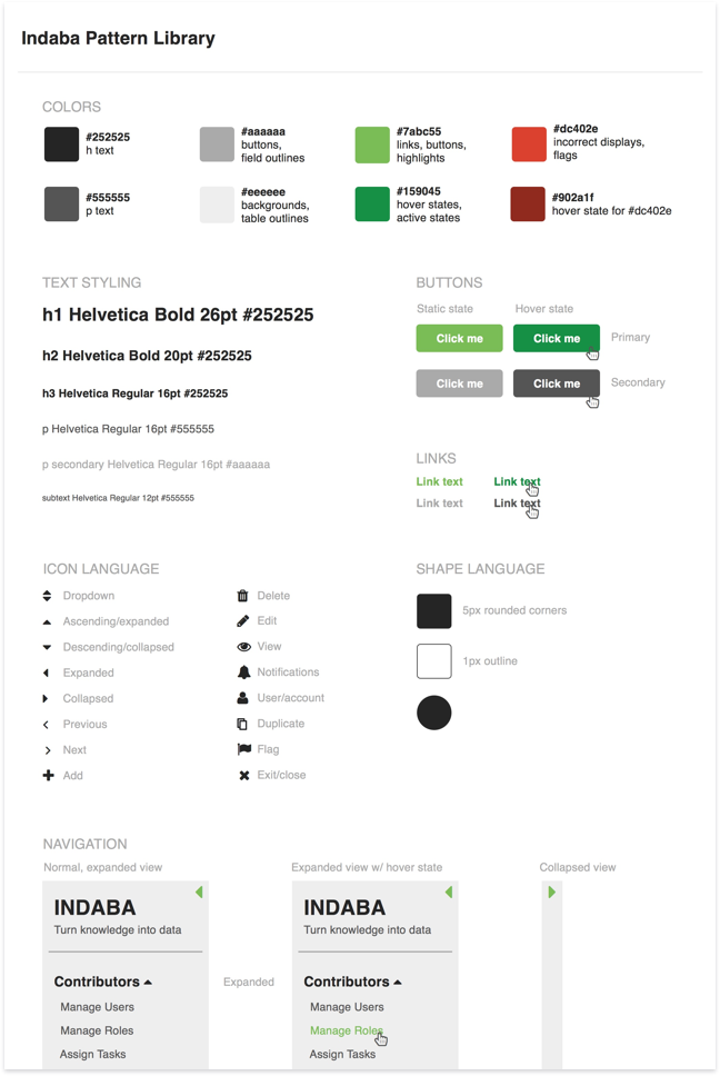
I began this project creating style tiles to get stakeholder buy-in on a stylistic direction. This initial exploration was focused mainly on colors and communication. Because Indaba was meant for a global and diverse audience, I did a lot of research into color associations around the world and tested designs against various types of color-blindness. After bringing a few options to the table, we decided to go with the green and red palette, making sure red errors were reinforced through iconography or italicizing text as needed for those with red/green color-blindness.
Refreshing the UI
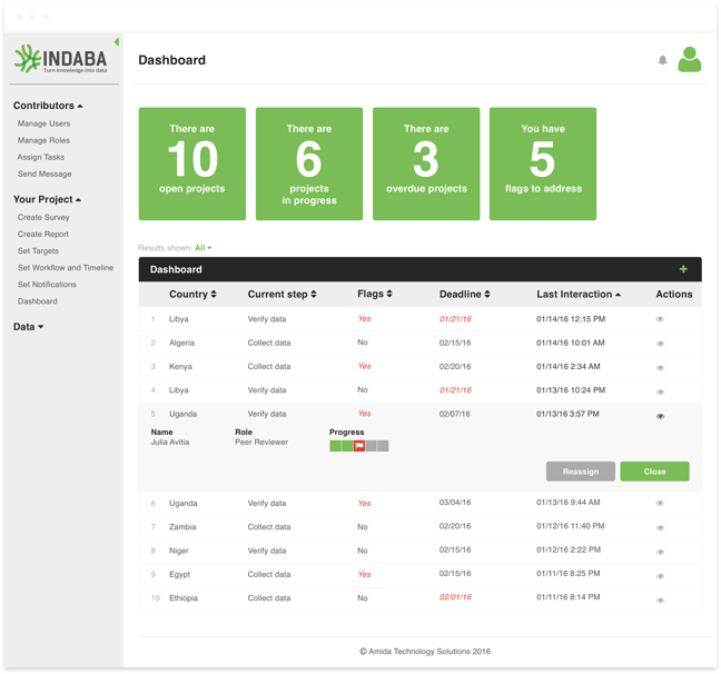
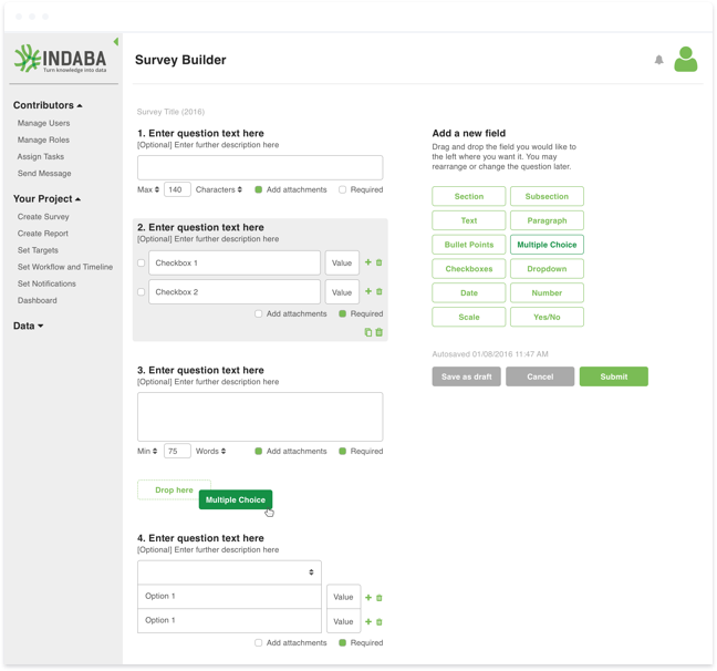
Although the bones Indaba had been built on were fine, the UI was oftentimes confusing or barely legible. And despite the fact that the problems we were solving for were complex, we wanted the experience to be as intuitive and straightforward as possible. I set to work giving the UI a facelift, simplifying where possible, and questioning the UX when interactions and features seemed unnecessarily complex.
Maintaining a pattern library
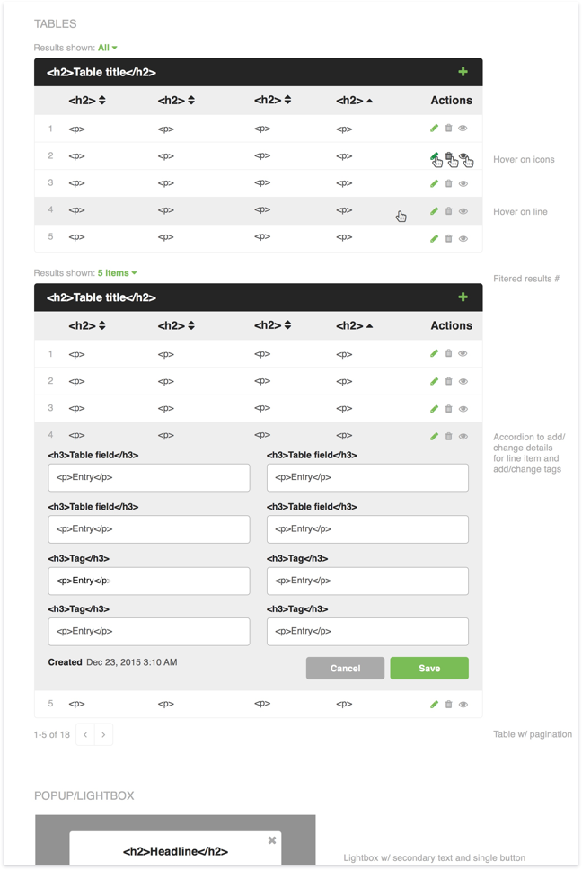
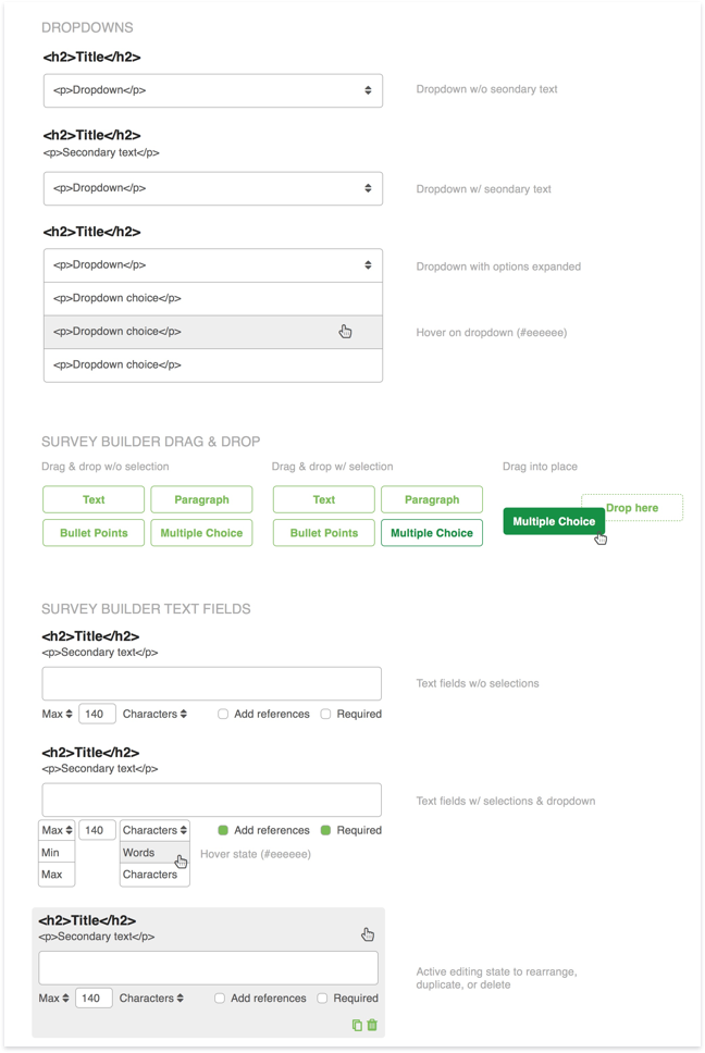
Since we were operating on a tight timeline and I was working with developers overseas, consistency and clear communication were both important factors in the success of this project. I created a pattern library to begin storing pieces that both I and the developers could reference. As I went through redesigning specific pages of the platform, I would reuse items from the pattern library and add new pieces as needed. Once designs were finalized, they were shipped with the inclusion of the pattern library for reference on pages that may not have been fully specced in design.
Selling the product
Most of the focus throughout this project was on the platform itself, although we knew Indaba would need a new logo and marketing site. For the logo, we wanted something simple that nodded to both the globally collaborative nature of Indaba as well as the transparency and openness of the data it would provide. As for the marketing site, we focused primarily on NGO audiences and knew that, at least to start with, most of our viewers would be in-bound leads.
Looking back
This project introduced two new challenges I hadn’t encountered before: working with an oversea team and creating a product for a global audience. In the past, I worked with developers who were typically in the same office as I was, or at least in the same time zone. Working across language barriers and having very little communication meant I had to be explicit and clear with everything I delivered, which helped me really consider the complexity I may have been introducing into my designs and ensured I maintained consistency throughout.
As for working on a product that could be used across the world, via a variety of different languages and internet connections, it made me value function over form and served as one of the best transitions from strictly visual web design into UI and UX design I could have imagined.