The National Park Foundation is the fundraising and advocacy organization behind the National Park Service. 2016 marked an especially momentous year for them as they reached 100 years of protecting and preserving over 400 national parks. To celebrate, they wanted to launch a new online experience, called the Connect Map.
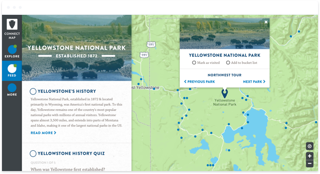
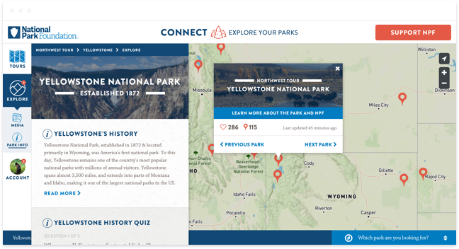
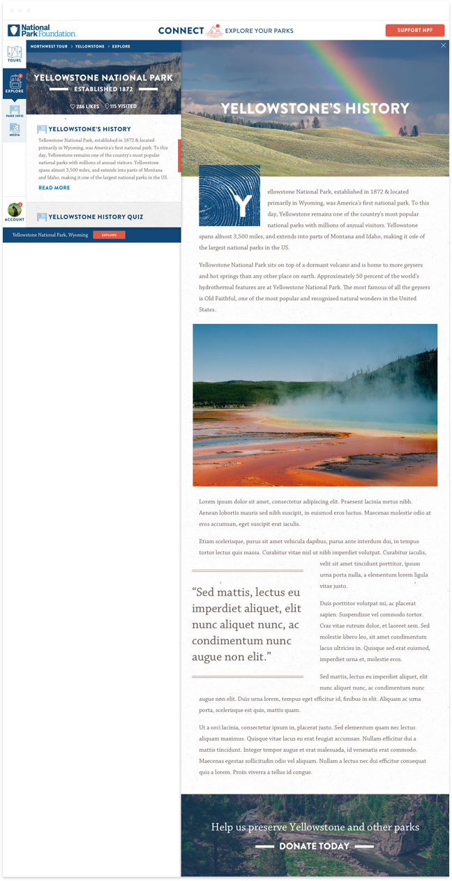
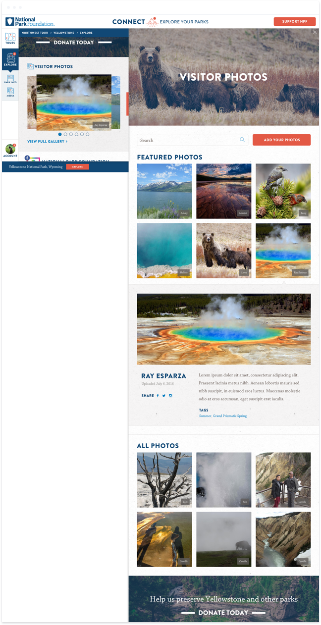
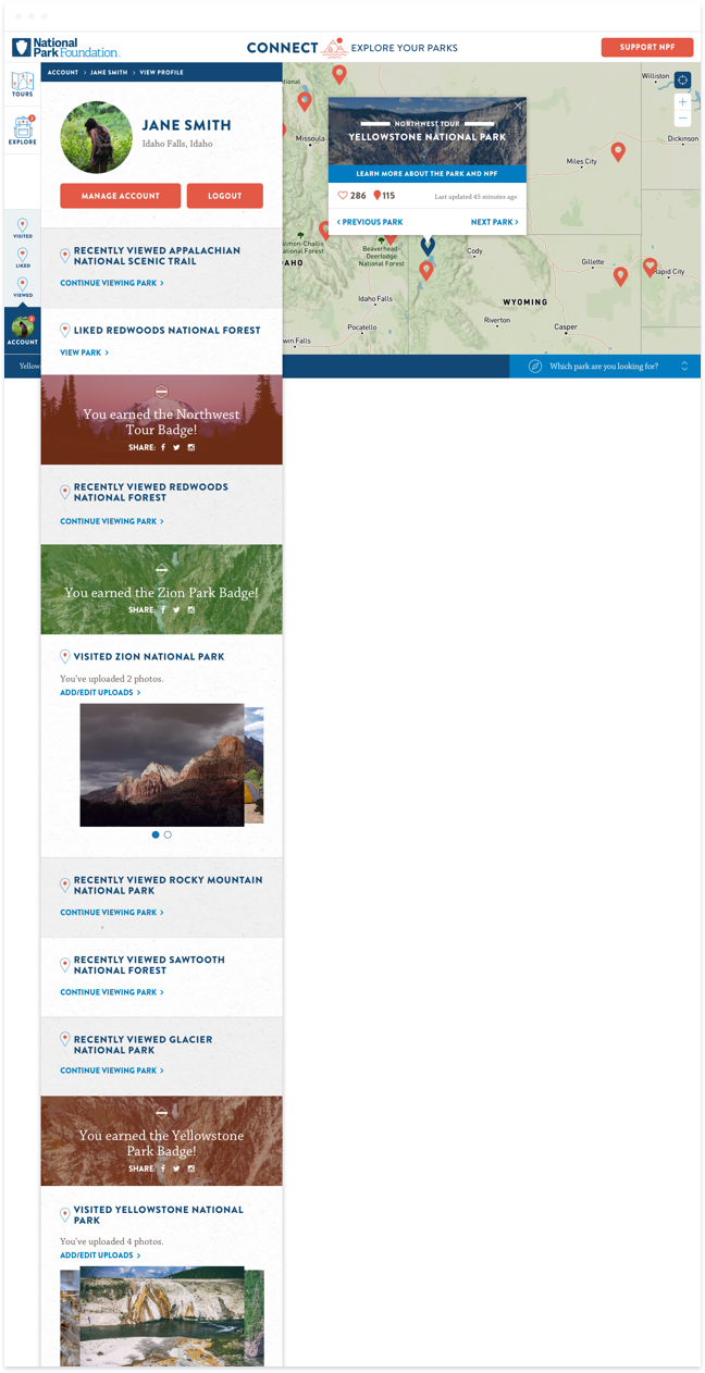
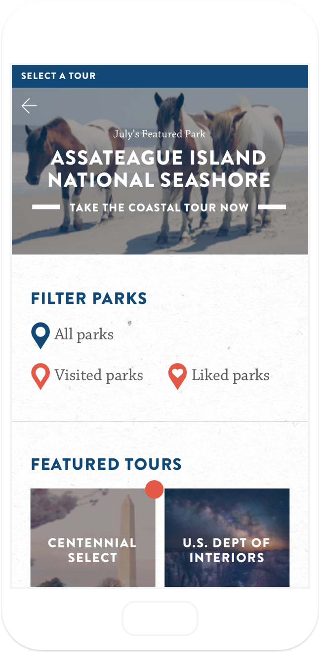
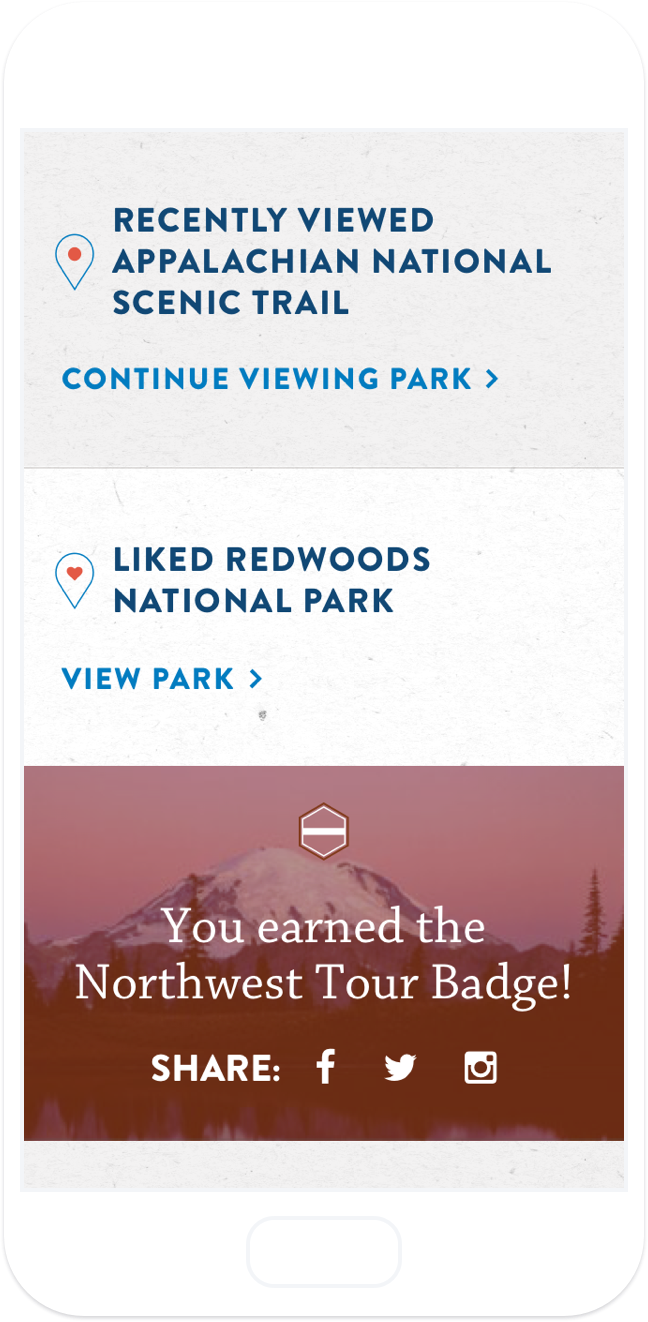
The goal of the Connect Map was to, as the name suggests, connect people more with their parks online via an interactive map and educate them on the history and impact of NPF to help drive fundraising. The project started out open-ended and I worked closely with the project manager to bring a long list of potential features down to a few primary focal points: give the visitor insight into the history of NPF and each park, engage visitors with quizzes and incentivize them to return with rewards, and allow the visitor to make the map their own by adding parks to a bucket list and checking off ones they'd visited.
Getting started
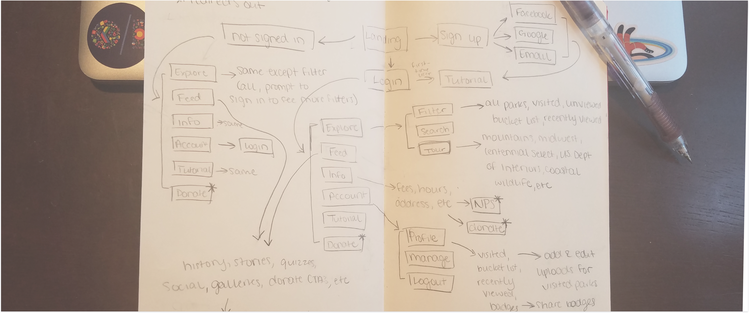
With a timeline set, requirements in hand, and a solid understanding of our tone, I set off to researching, site mapping, and wireframing.
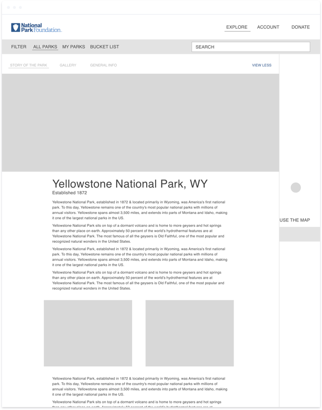
Wireframing started with desktop, as our hypothesis, based on the type of content we would be serving and the audience, was that visitors would more likely engage with the site on their desktop or tablet rather than on their phone. The iterations through the site maps and wireframes were key in honing in on the scope and final set of features.
Applying visual design
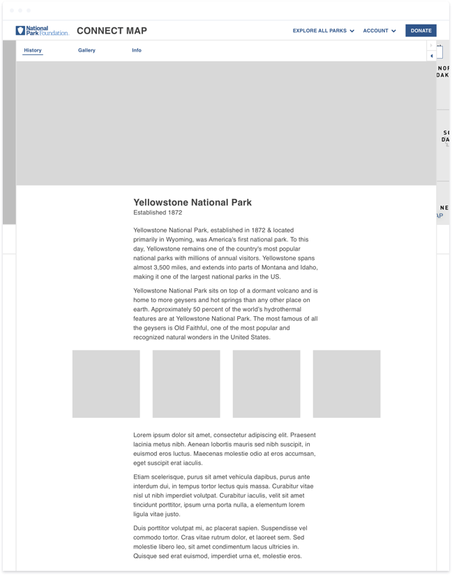
Once the wireframes passed client approval and were expanded into mobile to check for gaps or necessary adjustments, I moved on to visual design. In the earlier stages, I was focused on the overall look and feel and kept the finer details, such as iconography, as vague as possible.
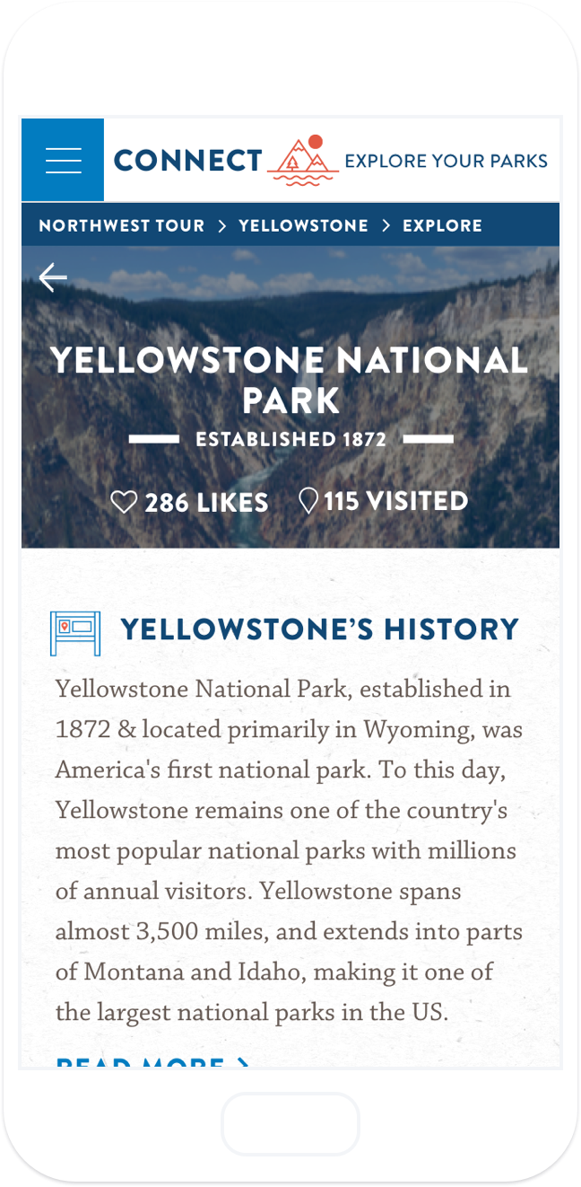
While most of the underlying style (textures, colors, and typography) were pulled from the soon-to-be-launched new NPF site, there was still plenty of room for exploration. We wanted the site to feel inviting and optimistic, but also needed it to take on a slightly somber tone, as if to say none of this would be here with NPF and their donors. The dark blues and photo overlays pulled from their style guide evoked a more somber side while the bright salmon brought hope and optimism back in.
Focusing on the details
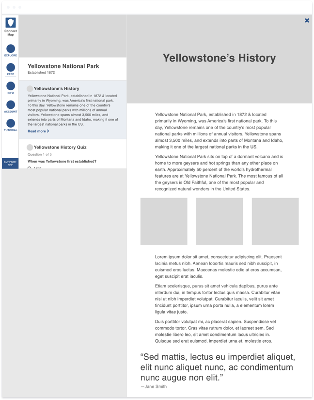
Finally, after rounds of design reviews and redesigns, it was time to get into my favorite part: the nitty gritty details, which in this case consisted mainly of creating the iconography. As a person who loves hiking, I was excited to create icons specific to NPF and exploring the great outdoors. For the info icon, I thought about the informational billboards they always have at trailheads. For media, I wanted to include both the stereotypical mountains = outdoors, as well a hint of the other, less stereotypical types of parks NPF protects, such as the Washington Monument in DC.
Making it mobile
Once we had client sign off on icons and desktop designs were 90% there, I switched over to the mobile designs. Although we did not go mobile-first on this project, I always had mobile in mind as I was designing for desktop. That helped a lot when it came to this part of the process as I didn’t feel a need to make too many compromises or changes to the desktop designs in response to how something was turning out on mobile.
Looking back
Unfortunately, the Connect Map never launched, but it’s one of my favorite projects I’ve had the opportunity to work on. It was great experiencing a higher level of autonomy on such a large project and I learned a lot about our national parks along the way. I’d encourage anyone who enjoys our national parks to donate to the National Park Foundation today.